Introduction
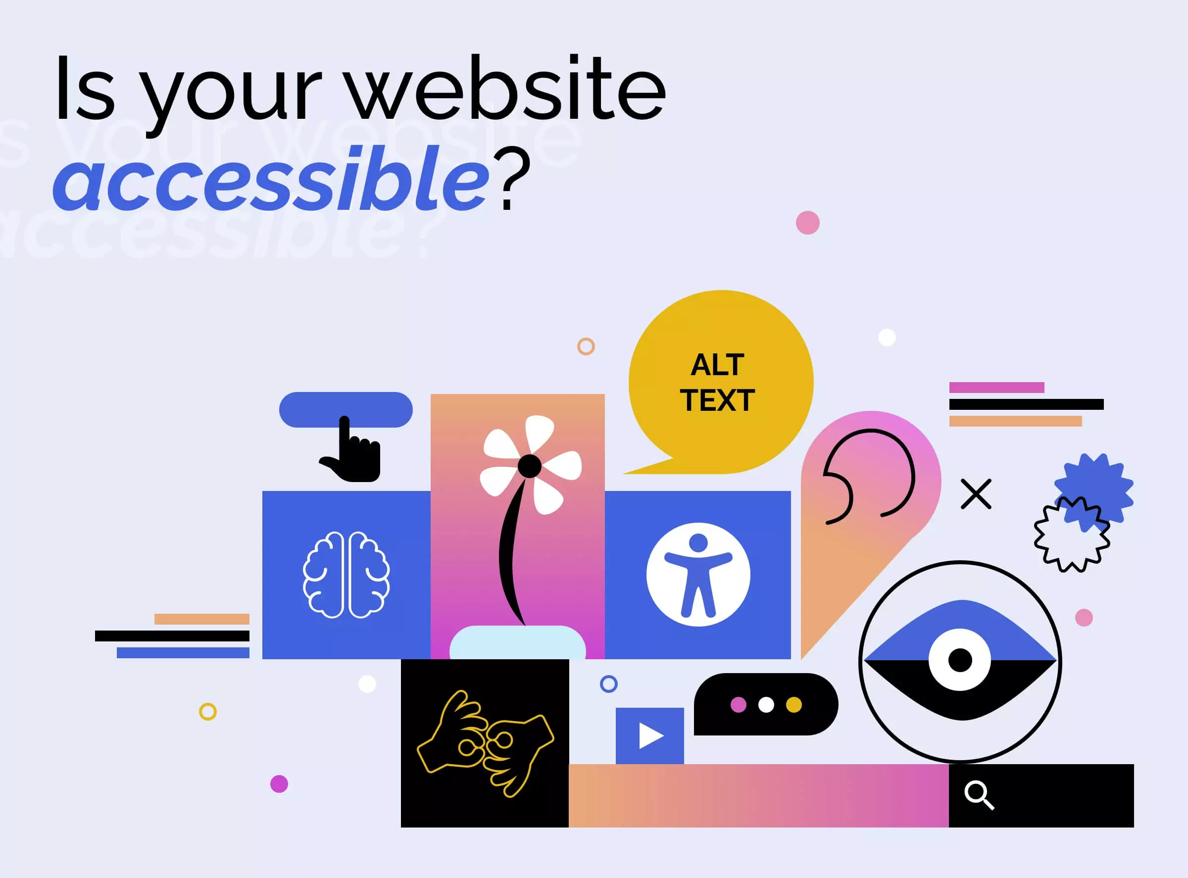
Web accessibility isn’t just about meeting checkboxes — it’s about creating inclusive digital experiences for everyone, regardless of ability. While many developers stop at ARIA labels and color contrast, true accessibility lives deeper in architecture, interactivity, and context.
In this post, I’ll go beyond WCAG 2.1 checklists and dive into the real-world application of advanced accessibility in modern web apps, particularly in React and Next.js environments.
1. Semantic Structure Is Not Optional
Screen readers rely on a clear semantic outline. Ensure your app’s HTML reflects a true content hierarchy — not just visual design.
✅ Use <main>, <article>, <section>, and <aside>
✅ Avoid <div> soup with ARIA roles where native elements would suffice
✅ Provide heading structure (<h1> to <h6>) that reflects the page’s layout, not its appearance
2. Keyboard Navigation: Native and Custom
All interactive elements should be accessible via Tab, Enter, and Space.
🔹 For custom components (modals, tabs, accordions):
- Manage focus manually with
refandfocus() - Trap focus inside modals
- Return focus to the triggering element on close
🔹 Use aria-expanded, aria-controls, and aria-live regions for screen reader clarity.
3. Forms with Feedback
Accessible forms go beyond labels:
- Use
aria-describedbyfor helper/error text - Validate in real-time but avoid overwhelming users with alerts
- Always pair visual indicators (like red borders) with text or icon alternatives
💡 Tip: Use libraries like react-hook-form with aria integration for scalable patterns.
4. Announcing Changes Dynamically
Single-page apps break traditional page loads. Inform screen readers of content changes:
- Use live regions (
aria-live="polite") for async updates (e.g. “Product added to cart”) - Announce route changes manually in Next.js using
useEffectonrouter.pathnamechange - Consider accessible skeleton loaders for long-loading content
5. Color Isn’t Enough
Designs often rely on color alone to convey state (e.g. error = red). Combine color with:
- Icons
- Text feedback
- Patterns or shapes
- Sufficient contrast (AA: 4.5:1 normal text, AAA: 7:1 preferred)
6. Testing with Real Tools
Don’t rely on Lighthouse alone.
- Screen Reader Tests: NVDA (Windows), VoiceOver (Mac)
- Keyboard-only Navigation: Try using your app without a mouse
- Manual Audits: Use Chrome DevTools + Axe extension for deep inspection
- Automated Testing: Use tools like Cypress with Axe integration for regression checks
Conclusion
Accessibility is not a feature — it’s a foundation. By baking accessibility into your component architecture, workflows, and user testing process, you create better experiences for everyone, not just those with disabilities.
The best time to build accessibly was yesterday. The second-best time is now.